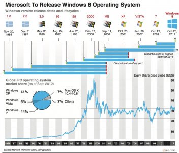
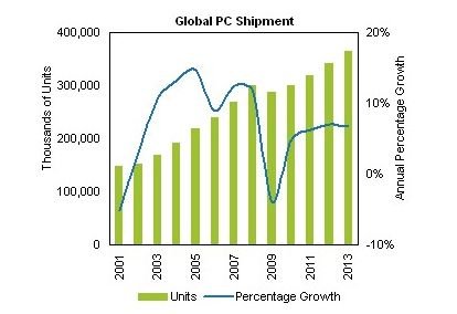
Again another good article by Ed Bott. Of course even his article is misleading though not apparently intentionally. The chart doesn't really go far enough in either direction. To get the full picture we need to see back to 2001 when XP came on line. Extrapolating for Windows 8 into the future is also very difficult given the very short time it has been out.
This chart is misleading since Windows 7 is essentially a replacement for XP. Vista was a legitimate bomb for a Windows product and therefore just made people hang onto XP longer building up demand for the next Windows after Vista. That puts the release gap from XP to Win 7 at about 8 years and the gap from Win 7 to Win 8 at about 4 years. This almost certainly contributed to a steeper curve for Win 7 than it would have had if Vista had been a success.
Also the mentioned shift to mobile certainly plays a large part. At some point in there the rise of mobile has made XP good enough for occasional use so that people aren't as inclined to move to the next thing, which in this case is Windows 7. It is clear that the decline of XP has been steady and doesn't seem to be significantly changed by the launch of Win 7 (the slope looks the same before and after). This actually seems to bode well for Windows 8 in some sense in that its launch completely flattened Win 7 sales.
Without older data giving a better picture of XP and a more data on Windows 8 it is hard to get the complete picture. Certainly the PC is declining in general but Win 8 may be enough to bridge the gap as far as being sold as both a "mobile" and traditional OS. I also think that Win 8 is significantly different (well half of it

) than prior versions of Windows. Although at each prior release there were people reacting like there were significant changes and the world would end with the new version, Win 95 to Win 7 is pretty much the same.
Ultimately time will tell if MS steered Windows 8 down the correct path even if only as a transition to a Windows that better suits the era of the decline of traditional PCs and the rise of mobile

JP


