What's new

Word 2013 a complete disaster.

tonyz3

New Member
No issues for me on both of my two external 23 inch monitors. Have you tried to calibrate the clear type. Also didn't you mention in another thread that you keep your screen set to 160 or 170% I would start with the clear type calibration. Also search the threads for someone who posted their color calibration file. It shows up as Samsung but really made my screen 100% better after using it.
 

Arizona Willie

Active Member
I have no problem with Word 2013 doc's on my ASUS 24" monitor. I suspect you have a video card problem or even a bad connection or cable.
 

Series7man

New Member
Same here. I have Word 2013 and Word 2010. Looking at the same document in both on a 24" monitor. No difference.
 
OP
mitchellvii

mitchellvii

Well-Known Member
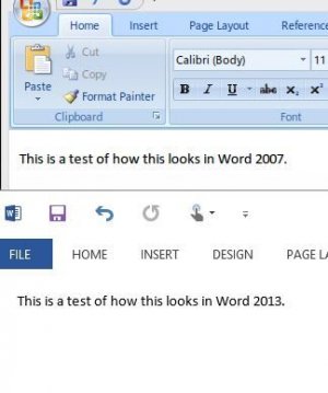
Thanks for the feedback guys. Don't know what is happening on your screens but on mine Word 2013 looks HORRIBLE and Word 2007 looks AWESOME. Here is a screen capture comparing the two. This on a 21.5 inch 1920 x 1080p IPS monitor.

Word 2013.JPG
As you can see, Word 2013 looks pretty awful. Word 2007 is taking advantage of ClearType, Word 2013 is not.

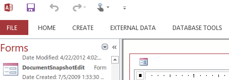
I initially thought Access 2013 was ok but on second look it's just as bad. Here's a screen shot of Access 2013 on my monitor:

Access 2013.PNG

Again the menu fonts are VERY jagged. No anti-aliasing at all.

Here is Access 2003. Very nice smooth fonts:

Access 2003.PNG
 
Last edited:
OP
mitchellvii

mitchellvii

Well-Known Member
I have a Dell 30" and Word 2013 looks great on it; no font issues whatsoever.

Can you do a screen capture for me? Thanks in advance.

I have read other forums with users having this same issue so I don't think I am having a hardware issue here.
 

compnovo

Active Member
Thanks for the feedback guys. Don't know what is happening on your screens but on mine Word 2013 looks HORRIBLE and Word 2007 looks AWESOME. Here is a screen capture comparing the two. This on a 21.5 inch 1920 x 1080p IPS monitor.

View attachment 560
As you can see, Word 2013 looks pretty awful. Word 2007 is taking advantage of ClearType, Word 2013 is not.

I initially thought Access 2013 was ok but on second look it's just as bad. Here's a screen shot of Access 2013 on my monitor:

View attachment 561

Again the menu fonts are VERY jagged. No anti-aliasing at all.

Here is Access 2003. Very nice smooth fonts:

View attachment 562

On my screen all four of your screenshots look equally good. You must have something going on with your PC.
 
OP
mitchellvii

mitchellvii

Well-Known Member
On my screen all four of your screenshots look equally good. You must have something going on with your PC.

Wait what? Not possible. These are images, not renders. There is no possible way they all look the same on your screen. If I take a picture of a pixelated font it will look pixelated on any screen of the same size. You mean they look the same on your large external monitor? Again, not possible.

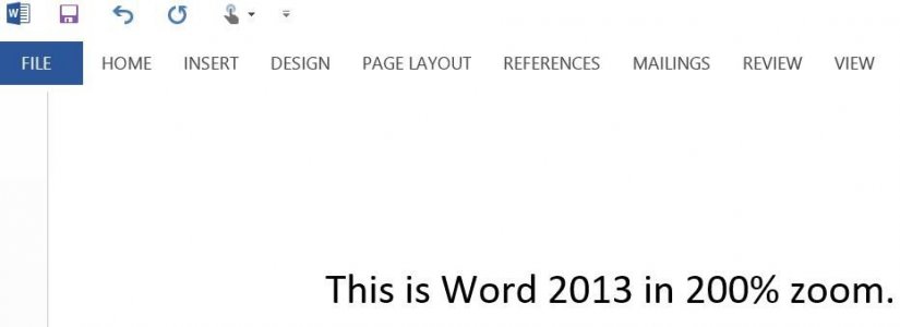
Here is another capture I just did of Word 2013 at Actual Page sizing. It is unreadable on a large monitor. Looks fine on the Surface because it is so compressed.

Word 2013 2.PNG
 
OP
mitchellvii

mitchellvii

Well-Known Member
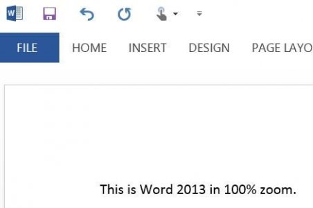
Thanks for that, but anything looks good at 200% zoom. At 100% zoom you can't even read it. Please do a screen cap at 100% zoom.
 
OP
mitchellvii

mitchellvii

Well-Known Member
Yep, that's pretty bad.

It is confirmed that MS has done away with ClearType anti-aliasing in Windows 8 Metro and Office 2013. Read here:

Office 2013: Further Evidence of the Demise of ClearType? » Quppa's Blog

Their reasoning is that most of the high DPI tablets (such as the Surface Pro) don't need it and ClearType doesn't play well with rotating screens, as in tablets. Unfortunately, for those of us dinosaurs still using good old monitors, we are screwed.

So is MS forcing us to buy their Surface Pro by making Office 2013 look terrible on our PC screens? Sorry but this is getting VERY OLD, VERY FAST.
 
Last edited:
Top